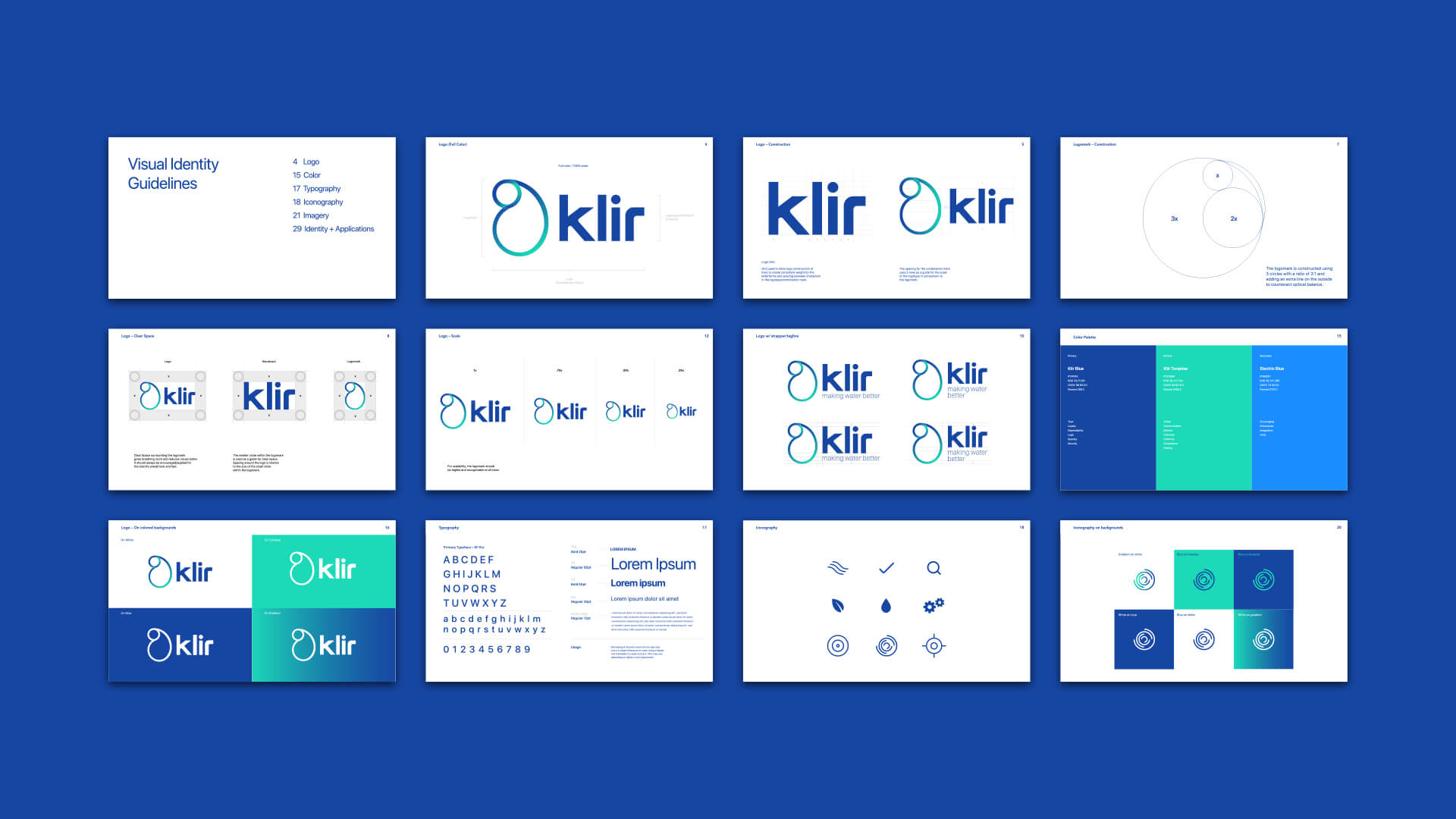
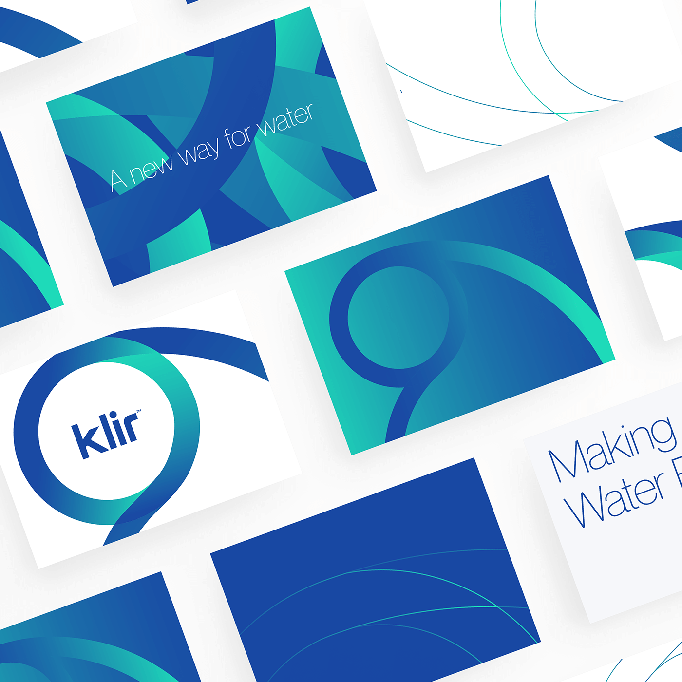
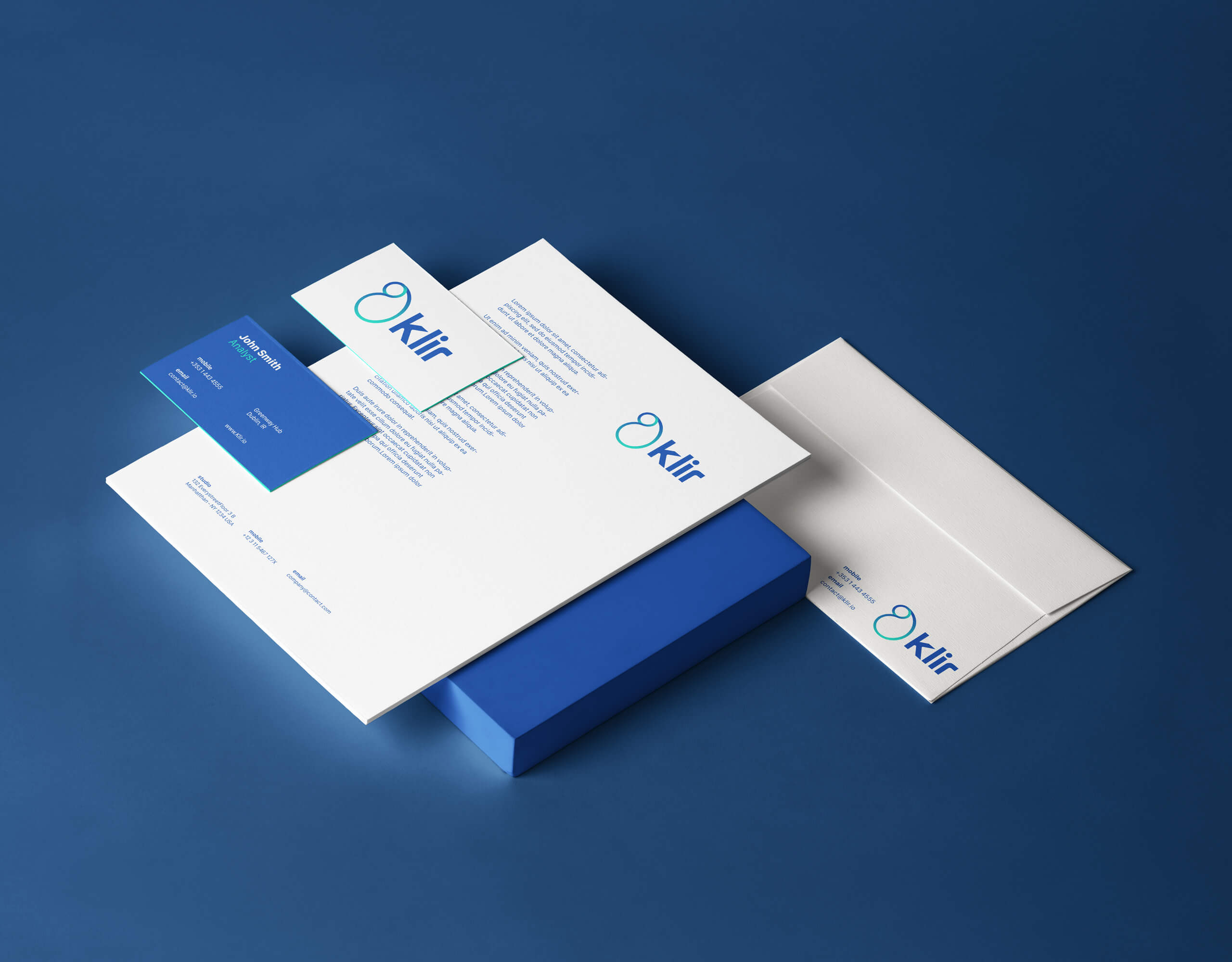
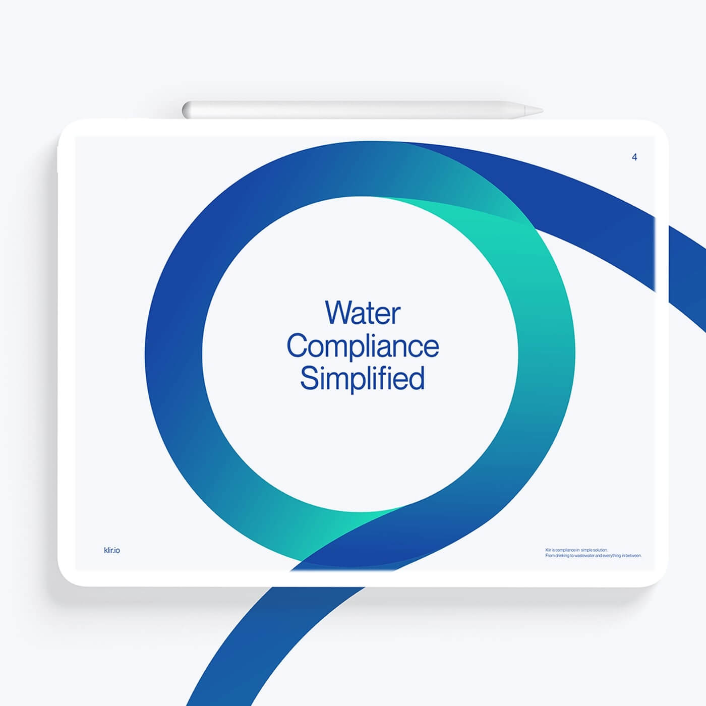
A young and daring tech company that could make better water for the world, Klir needed an innovative brand. They came to us so their technology could be taken seriously in the international market. Working directly with their business consultant, we started around the idea of water and the things it represents; purity, fluidity, and motion.
Close Cookie Popup
Cookie settings
By clicking "Accept all cookies", you agree to storing cookies on your device to enhance site navigation, analyze site usage and assist in our marketing efforts as outlined in our privacy policy.
Close Cookie Preference Manager
Cookie settings
By clicking 'Accept all cookies', you agree to storing cookies on your device to enhance site navigation, analyze site usage and assist in our marketing efforts as outlined in our privacy policy.


